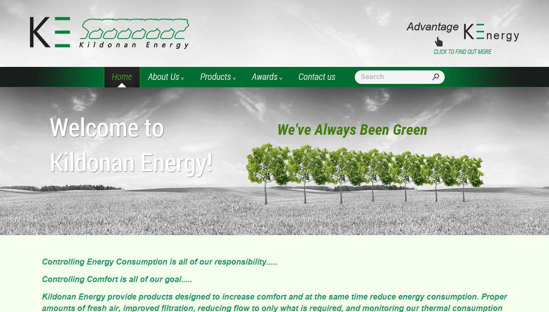
A company that accentuates sustainability, energy-efficiency and comfort has to be represented by a website that gets those three messages across at the very first glance. The page design should be soft, pleasant to look at and minimalistic. Visuals (i.e. fonts, backgrounds and imagery) should be in perfect correlation with what the company stands for, conveying the message of calm and stability.
For this, we chose a soft grayscale background with a row of green trees on it. It is a visually neutral, non-distracting choice that still has a strong message - we stand out by making the world around us a better place. The font is Arial, an easy to read sans serif, its color depending on the background, mostly being white or tints of green. The menu is a green stripe with dark gradients on the edges. Those are meant to focus the visitor`s attention on the main menu items in the center. The overall message of the elements and color choices is calm stability. It makes the user comfortable and promotes trust and connection to the firm and its products.
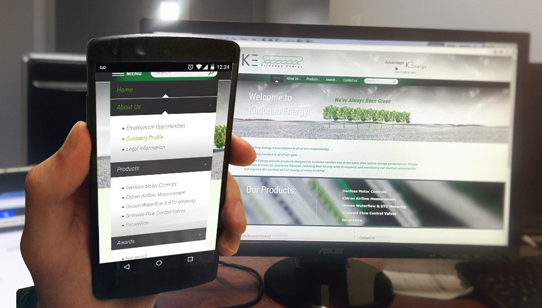
The site is easy to browse and navigate and is also mobile friendly, making it easy and accessible from any device.
Project Technologies:
PHP, MySQL, HTML, JavaScript, Ajax


