Couple of month ago we asked ourselves what we’d like to see in websites in the near future, what features, components, interesting design solutions. Considering the fact that new technologies such as jQuery, MooTools, Ajax, widgets, get more and more popular among web designers providing whole new level of interactivity, it was interesting to find out how it will affect approach to web design along with fresh graphical solutions. So we’ve done our research and discuss the topic with our associates, colleagues and other professionals and here is the summary of what we’ve found out.
1. Typography
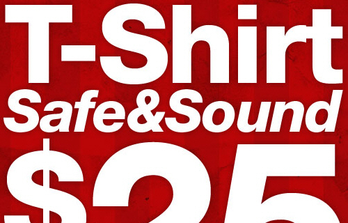
Big, bold, graphical or not – font is a key part of web page design delivering message, value proposition and reason for the visitor to go further. So our fellow designers do whatever it takes to catch attention and don’t get message missed:
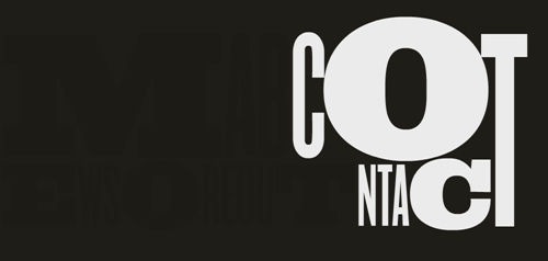
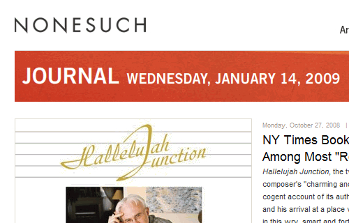
a. Special effects such letterpress or other creative use of fonts
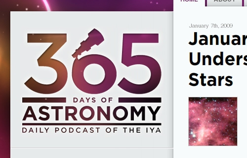
b. Huge titles – still popular

c. Font replacement
Font replacement techniques (sIFR for example) exists for some time by now, but now it really taking the momentum as designers want to generate the text in required font rather than keep it as an image. Quite obvious it adds flexibility generating whatever title you need on any page on a fly, especially on database driven sites where titles can be any.
2. PNG Transparency
With IE6 becoming a history and all current browsers supporting PNG transparency, it gets more and more popular by giving more flexibility. Along with options provided by CSS, use of semi-transparent images giving whole new dimension to what actually can be created and increasing number of designers is pushing the envelope to explore it.
3. Speaking Navigation
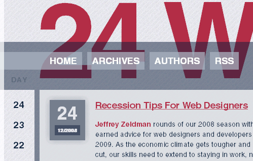
To ensure you get it right (although we doubt it’s necessary in many cases) designers put a note under the main menu item disclosing in couple of words what to expect. Trend is picking up, although we think it’s just to try something different and to enhance navigation look.


4. Creative layouts
a. Out-of-the-box layouts
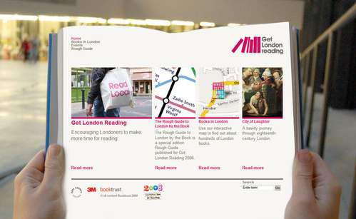
b. One page layouts
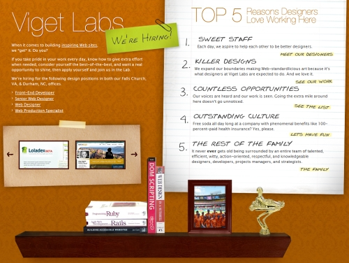
c. Multiple columns layouts
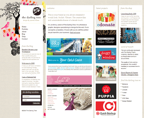
d. Open space layouts
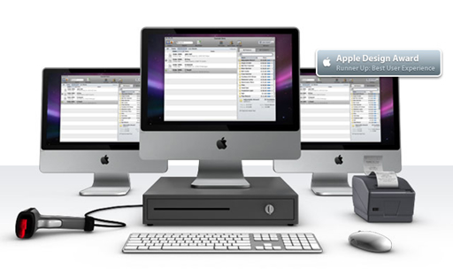
5. Use of large illustrations and graphics
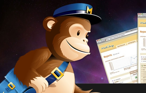
If graphic or illustration is truly stunning, it makes the website really stand out. If graphics is not only stunning, but used to the point it makes website take a part of visitor’s mind substantially increasing conversion.
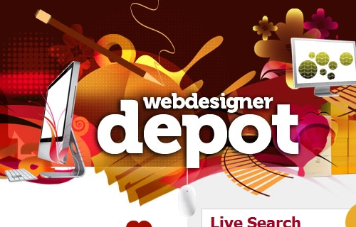
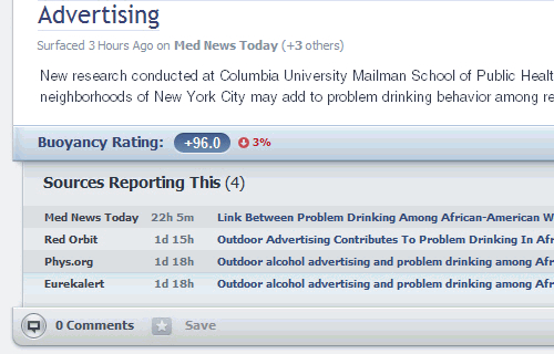
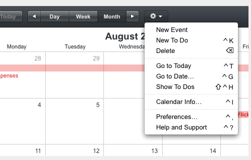
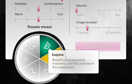
6. Rich interfaces
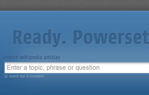
Even a simple table is not that simple anymore with all that tricks thanks to AJAX, jQuery and other guys. It complicates the page and many may say against it, but look, it’s fun to use.
7. Media
Video, audio, inside, on the home page – you mention it. It can go everywhere and utilized by many different ways.
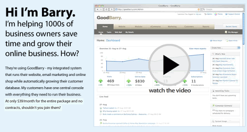
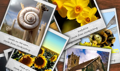
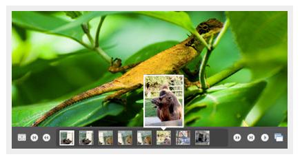
8. Rich slideshows and carousels
It’s really fun to view how some services or products can now be presented. It’s so fun that special effects sometime grab more attention than content. However in many using rich slideshows actually increase usability, and appeal to the visitor.
9. Wider use of social platforms: WordPress, Twitter, Facebook, MySpace.
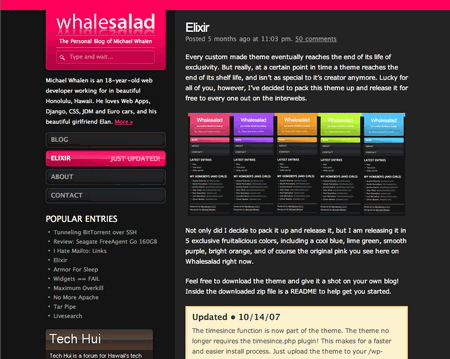
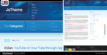
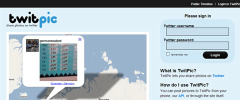
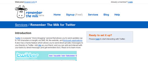
For those in love with social media it’s probably the best time. Hundreds of well done templates and plug-ins for WordPress make this platform for many applications whether you are a service, products or content provider. Twitter gives a lot of tools for customization, personalization of your page while providing rapidly growing social platform.
Andrei Medvedev, WebExpertise.biz
Used resources:
www.smashingmagazine.com
www.nettuts.com
www.konigi.com
